One of the most popular and exciting feature requests we often hear about from our amazing community is a dark mode for the entire GitLab UI. It's currently the second most upvoted issue for all of GitLab.
Next to being very popular in the design and development world, a dark mode can be incredibly helpful for users with vision impairments. One of our community members posted this comment, that demonstrates very well how valuable it can be to give users the chance to choose between a light and a dark mode:
It really comes down to website accessibility. I am legally blind and part of my eye condition is something called photophobia (which is poorly named—it's not a "fear" of light, it's that direct bright lights, especially sudden direct bright lights, are like having an ice pick shoved into my eyeballs.)
At GitLab, we believe in small changes and fast iterations. When our Design team was thinking about how we could split this up and tackle it in small steps, we looked for isolated pieces of our UI that we could create a dark mode for, and the feature that stood out was the Web IDE.
What is the Web IDE?
The Web IDE (Integrated Development Environment) is a code editor in the browser that allows you to change multiple files at once. Afterwards, you can commit their changes to a branch and create merge requests to discuss those changes and eventually merge them.
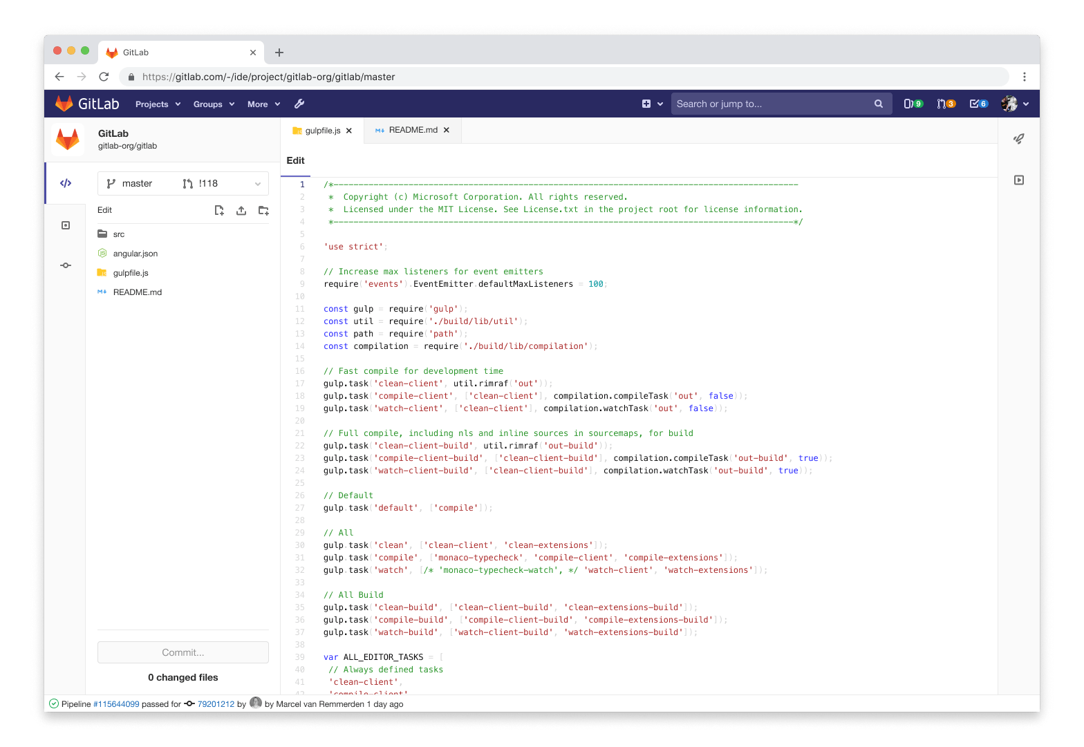 The GitLab Web IDE
Users of the Web IDE find it to be helpful for quickly making small changes or easily viewing their files in a familiar context, similar to their appearance in a local editor.
Syntax highlighting
After deciding the Web IDE would be the first feature of the GitLab user interface (UI) to get a dark mode, we faced one fundamental question: How would the dark mode align with syntax highlighting themes already within GitLab? There are several themes that users may choose to display their repository files, snippets, or other code elements in their preferred way.
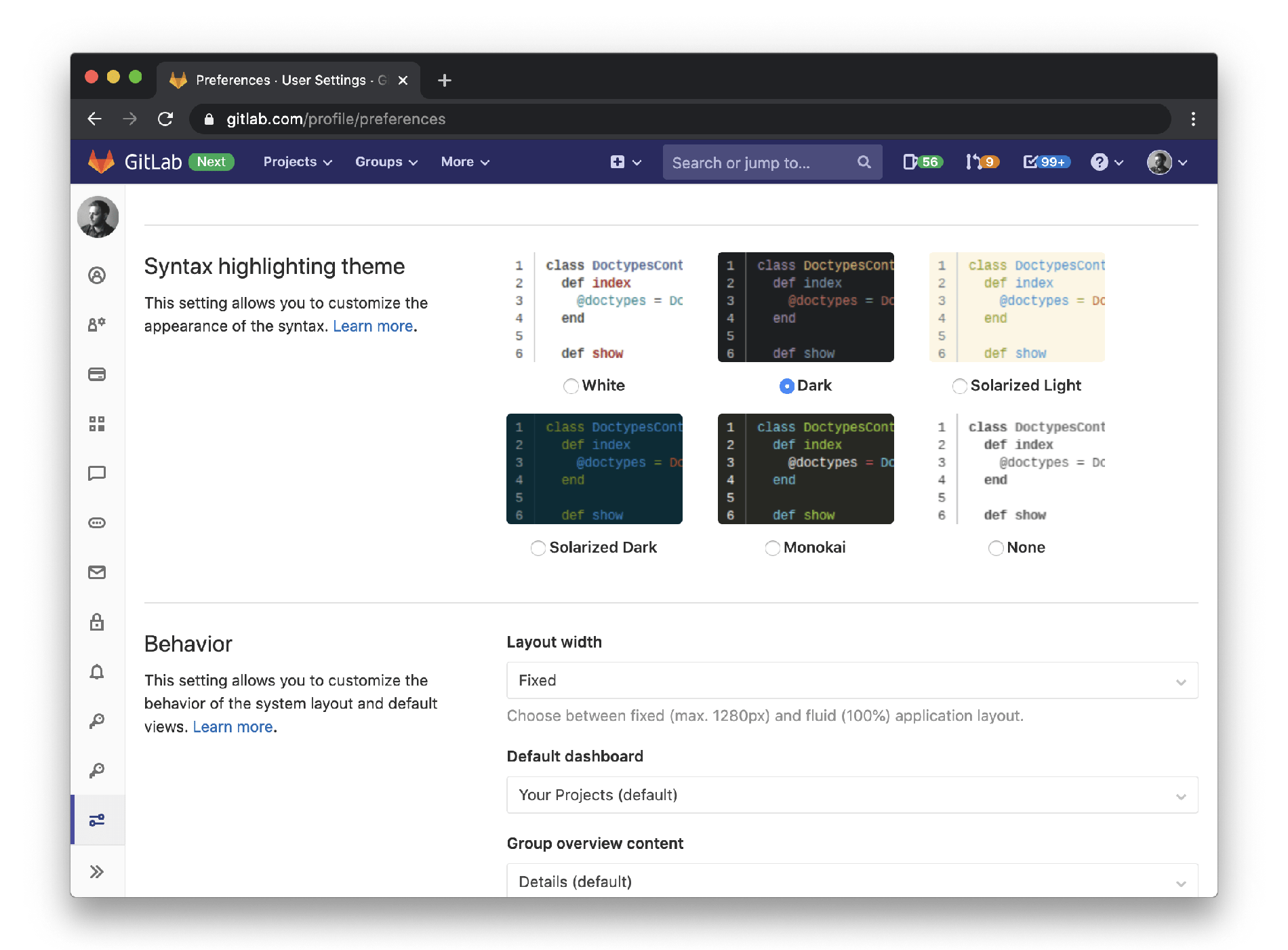 User syntax highlighting theme settings
The Web IDE exists as a tool within the larger context of GitLab. Similarly, the syntax themes exist within the context of the Web IDE. Our goal was to avoid scenarios where the code area that follows the syntax highlighting theme wouldn't be aligned with the rest of the UI, which could be jarring.
We made the decision to keep the settings easily consumable, and treat the dark mode for the Web IDE UI as an extension of the dark syntax highlighting theme. From version 13.0 on, you can enable it by selecting the dark syntax highlighting theme, and the rest of the Web IDE will automatically follow. This also gives us the opportunity to later extend other themes and align the rest of the Web IDE UI to their colors.
The design process
Light and dark UI vs. themes
Initially, we defined a few concepts to help shape our approach. We refer to light and dark UI in terms of the qualities they have, like brightness, depth, structure, and hierarchy. In GitLab, themes are preferential styles that reside on the UI, and use color to change only the appearance of a few elements.
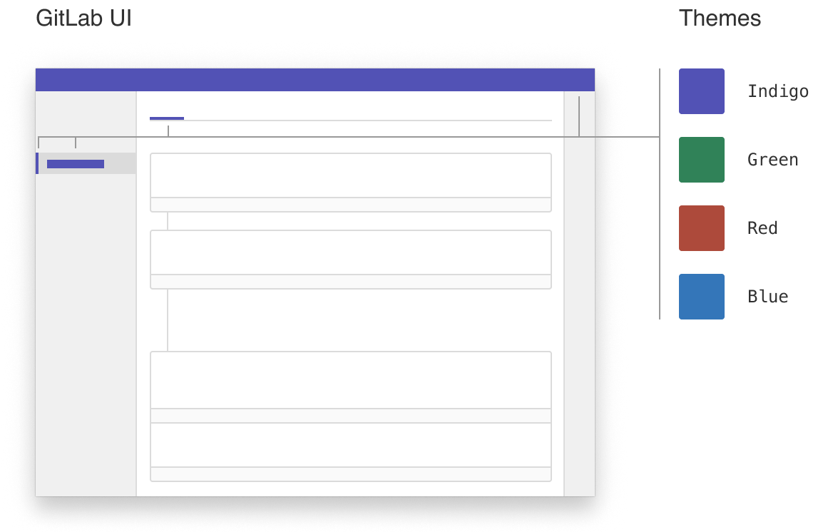 The difference between the UI and themes in GitLab
Working in Figma
Figma community
As soon as we wanted to start experimenting with the UI, we noticed first hand that "Everyone can contribute" is not only GitLab's core mission, but also an idea that is very much alive in the Figma community. The amazing designers at Microsoft have open-sourced a design toolkit for Visual Studio Code that allowed us to easily grab the relevant pieces, plug them into our own design file, and manipulate them.
Asynchronous feedback
Another aspect that's deeply embedded in GitLab's ways of working and the way we build our products is asynchronous collaboration. We are the largest all-remote company in the world, and the two designers working on this feature are located in time zones seven hours apart.
Using Figma to collaborate and give each other feedback on our ideas enabled us to ship this feature with only having to schedule a single meeting, and the rest of the discussions handled via Figma comments. As these discussions were between designers and purely around visual aspects, we kept the discussion inside of Figma instead of using our own Design Management features, which came into play later during the discussions with the engineer working on this feature. It also allowed us to easily involve a lot of other team members, and get comments from other designers all over the globe.
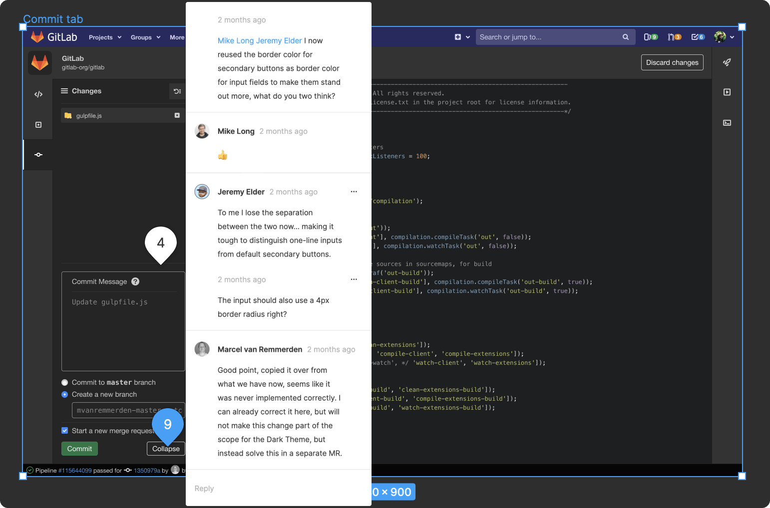 Async design feedback in Figma
Design challenges
The overarching design challenge was, and continues to be, understanding how the appearance of elements change as they appear in light vs. dark UI. Generally, structural, container-like UI elements decrease brightness, but content works the opposite and is sometimes nearly inverted. The fundamentals of light, shadow, and depth don't change, but the way the elements leverage them does. Similarly, the principles of content legibility, hierarchy, and contrast don't change, but the content does to uphold those principles.
In the side-by-side example below, we've compared just a few UI elements to demonstrate how they could change between light and dark UI.
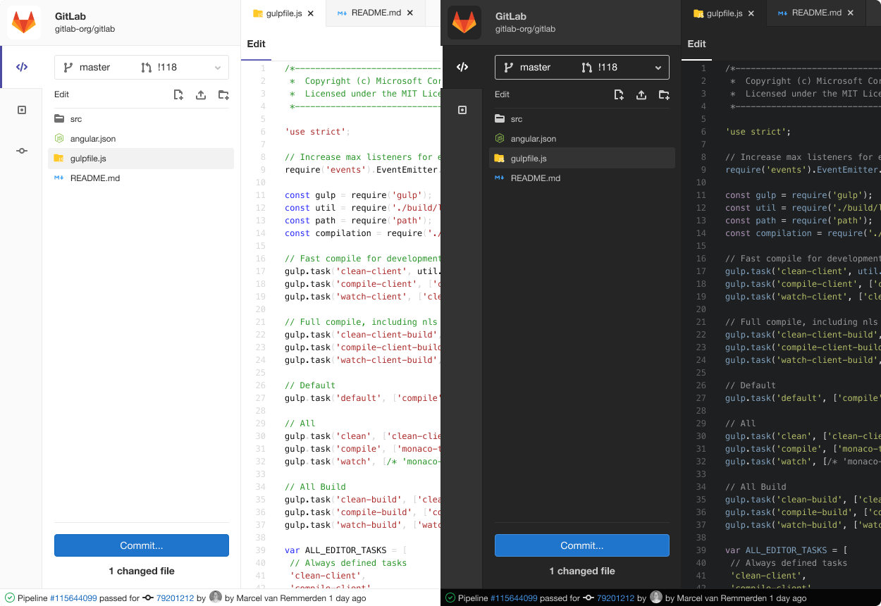 Comparing light and dark UI in the Web IDE
When we map the changes in this small sample, patterns start to emerge. Elements like backgrounds evenly shift darker together to maintain the same sense of depth, while some text content nearly inverts, and the button almost stays the same.
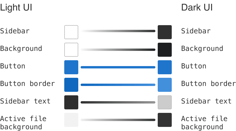 Mapping element color in light and dark UI
At face value, it can seem as though many elements are inverted, but that's an oversimplification that leads to an interface looking not quite right. Here's how we're thinking about a few of the specific design challenges we encountered.
Stateful elements
In a light UI, we darken element states to increase contrast, and typically do the opposite in a dark UI. This wasn't the case for tabs and similar elements that have backgrounds more closely integrated into other sections of the UI. And while the borders on the buttons got lighter, the background didn't because we needed to maintain text contrast.
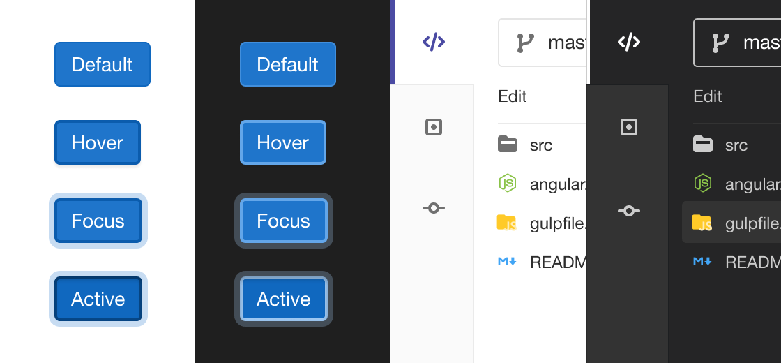 Comparing element states in light and dark UI
This uncovers nuanced differences in the approach between dark and light UI, and we're still ratifying differences and establishing repeatable patterns. Needless to say each element deserves plenty of attention.
Visual hierarchy and depth
As mentioned above, depth in dark mode was generally approached in the same way as in a light UI. Brighter elements are more forward, and darker ones recede. In the case of tabs and the file tree we are using a different approach and making these areas darker to increase contrast, rather than evenly darkening layers. We're learning that depth and contrast can both be effective tools, but they aren't always used the same in dark and light UI.
A quick note on shadows, they shouldn't be replaced with glows — a completely different effect. Shadows are noticeably less effective in dark mode, so we explored more variance in gray backgrounds for neighboring sections.
Graphics and illustration
Graphics created for a light UI can seem garish or out of place in a dark UI. Images should be addressed on a case-by-case basis, but illustrations and icons can be addressed as a whole. We're exploring CSS variables and classes for SVG fill and path colors. One example that we had to solve were pipeline status icons. These exist in a couple of places in our product and initially had a white background. As this makes them stand out too much in dark mode, we had to rewrite their SVG code to get them to be transparent instead.
![]() Ensuring that graphics, like icons, can be adjusted too
Ensuring that graphics, like icons, can be adjusted too
With that in place we could map light and dark palettes. For now we're just ensuring that there aren't backgrounds in SVGs that feel out of place.
How to ship in small pieces
Our philosophy is to release changes or features as soon as they can help users. This sometimes leads to us shipping features that are not completely polished, which is in line with this famous quote by Reid Hoffmann, the founder and CEO of LinkedIn:
If you're not embarrassed by the first version of your product, you've launched too late.
The first version of this feature we released had only the code area styled with the dark syntax highlighting theme. Even though it felt a bit out of place, we received good feedback, which was evidence we were headed in the right direction.
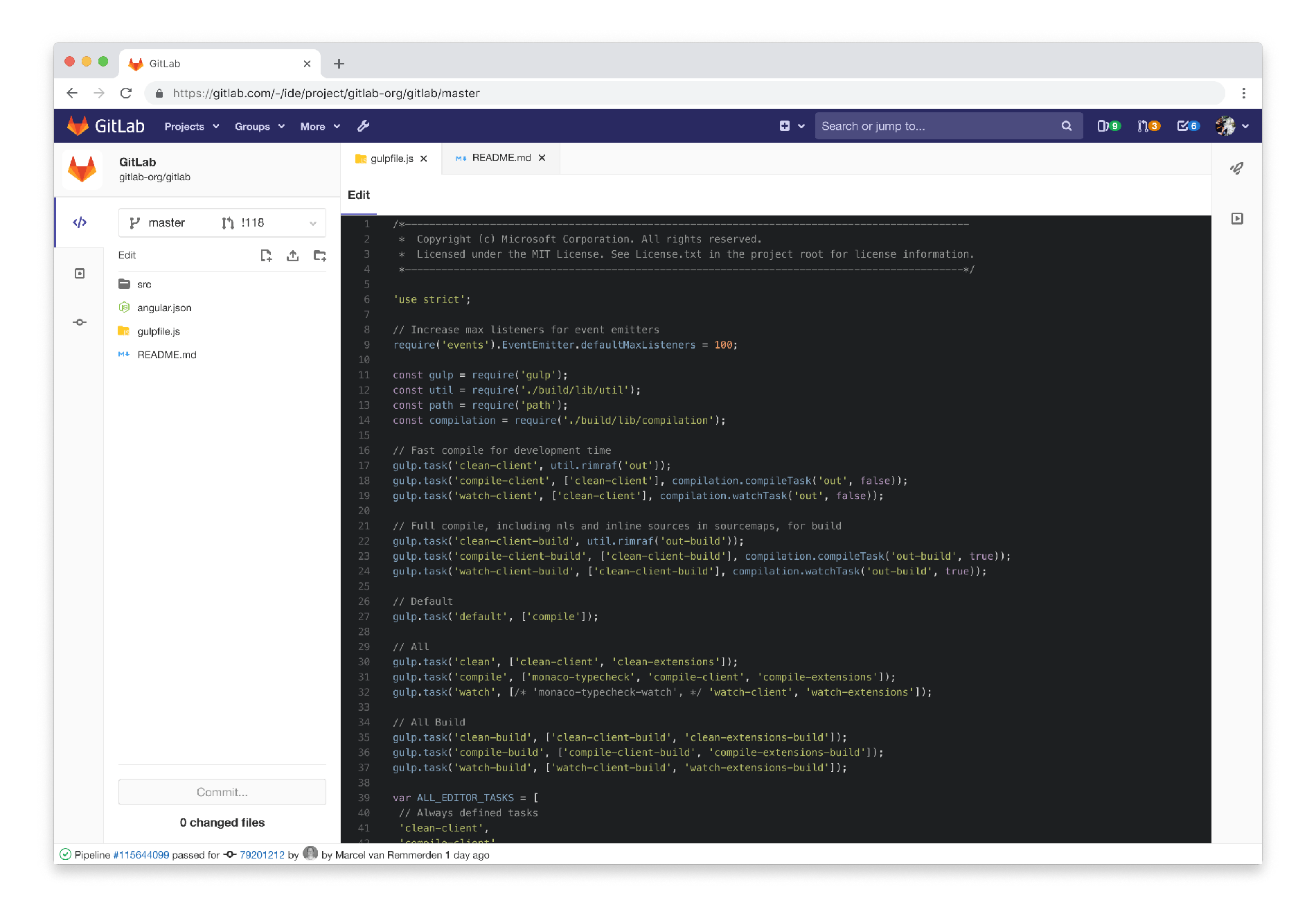 MVC dark mode with light file tree
From that point on, we sliced the remaining UI into smaller pieces. Every time we finished a piece, we released the newest version to all our users and started working on the next area. This highly iterative approach would not be acceptable in a lot of other companies, but at GitLab we believe in minimal viable changes (MVC).
Another thing we learned was that a dark mode exposed not only structural UI deficiencies, but also inflexible code. Our initial intention was to leave a couple of seldom visited areas unstyled, but we noticed that keeping CSS styles from bleeding over into these areas would cause more problems and effort than fixing it altogether.
Effective prototyping
As demonstrated in the previous paragraphs, one of the toughest challenges when designing a dark mode are elements with multiple states. This is also one of the aspects designers are still struggling with when prototyping, which led to us tackling this problem in a couple of ways:
- Creating a large prototype with many artboards to represent edge cases and states
- Relying heavily on a well-defined color system
- Multiple sync calls with an engineer to fix smaller aspects, e.g., animations on the fly
For the next iteration of the prototype, we are going to investigate whether we can leverage Figma's components in a way that buttons have the same hover/focus/active states on multiple artboards. We have set up a first small test to prove that it would be possible, but haven't used it on a more complex prototype yet.
 Web IDE prototype in Figma to demonstrate states
What we learned so far
- Answering questions for dark mode leads to many questions about why we're doing things a certain way in a light UI. It creates a great circular effect that challenges how we think about the entire UI, which leads to solid convictions.
- Even a dark mode can be worked on in small iterations. Over the course of this process, we have created dark versions for all Web IDE specific UI elements, but also for dropdowns and modals, which are global elements. This not only makes it easier for us to think about the design, but also about how the code should be structured for a global dark mode.
- We are clearly standing on the shoulders of giants. Designing and developing this dark mode at such a fast pace was only possible because we had many great in-depth resources about dark mode available to us. The two that stood out the most are Apple's Human Interface Guidelines and the dark theme section from Material Design.
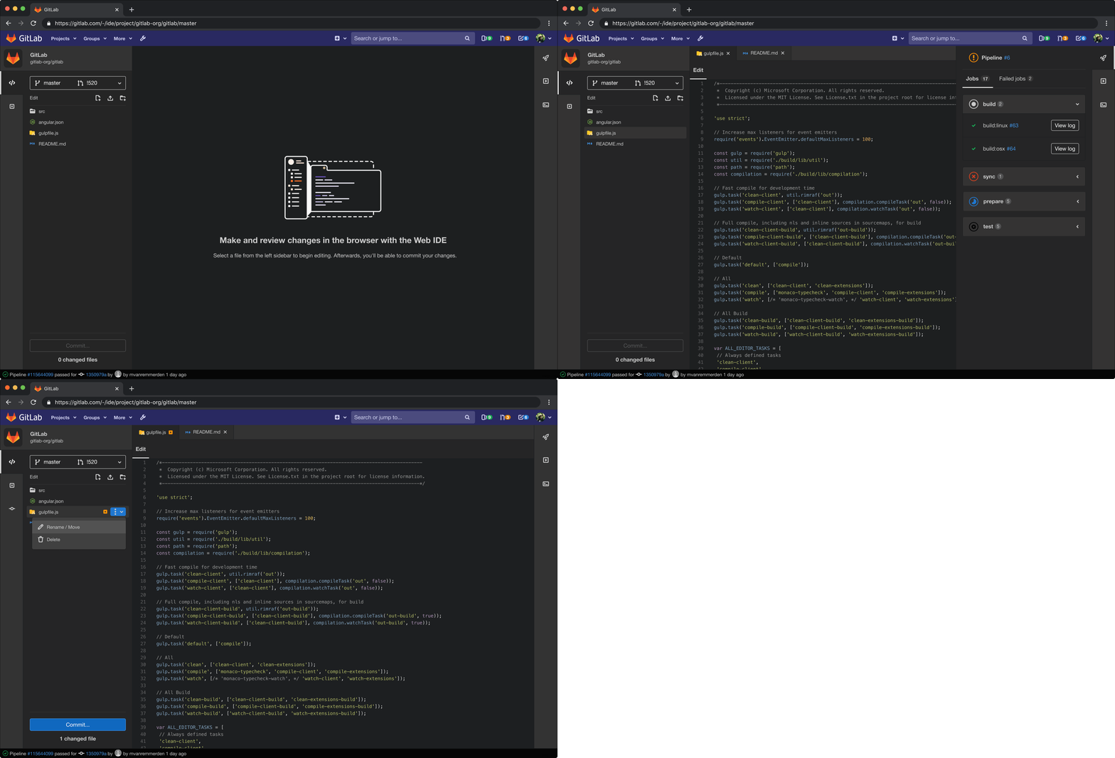 Web IDE dark mode
Next steps
- For the Web IDE as a feature, we're in the process of making our code more easily themable, so that other syntax highlighting themes can be extended more flexibly.
- We're also planning to clean up the prototype we created, and either create a Web IDE UI Kit, or integrate it into our Pajamas design system, so that others can easily access, modify, and contribute to it.
Lastly, you can contribute too! We would especially love to see contributions to extend the other syntax highlighting themes to the rest of our Web IDE UI. If you have anything else in regards to the Web IDE you'd like us to consider, create a new issue and be sure to tag the GitLab UX Department (@gitlab-com/gitlab-ux). If you'd like to be part of our testing efforts at any level, sign up for our GitLab First Look program. You can also contribute to the design of GitLab by starting with our Pajamas UI Kit in Figma.


