Published on January 16, 2015
4 min read
Pragmatic Redesign for GitLab
In this post, we'll show you why we're changingthe the GitLab 7.7 user interface, how we did it and what the end result is.
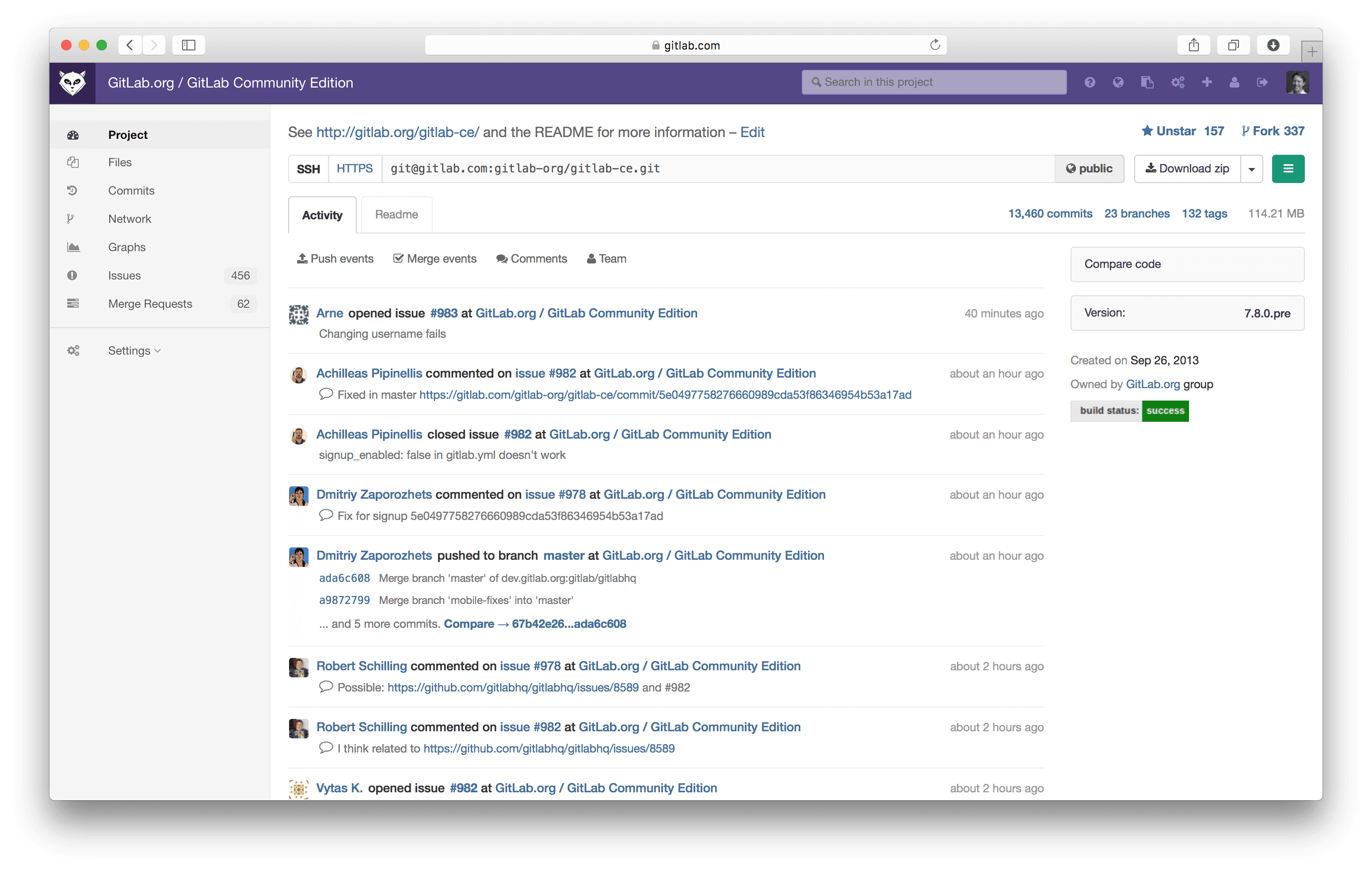
We have some big UI changes coming with the release of GitLab 7.7, on January 22nd. In this post, we'll show you why we're changing the user interface, how we did it and what we ended up with.
Redesign to Solve Problems
Changes to the interface are always stressful. So you shouldn't even start to redesign without a list of issues you intent to solve. This way, your users get compensated for the changes with improved usability.
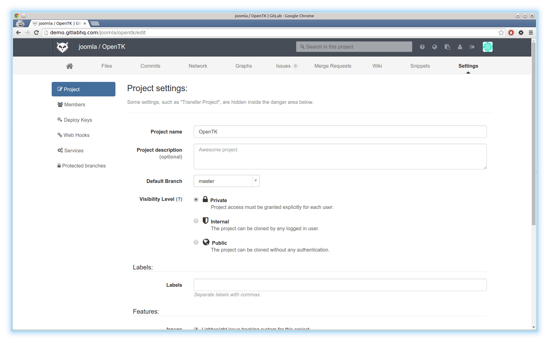
There are several problems with the current UI of GitLab and it was hard to fix them without making big changes. This is the list of issues we started with:
- Limited space in project navigation. We can't fit all items with counters
- Two stacked levels of navigation is expensive in screen real estate
- All navigation is on top. It's annoying to have to scroll up to navigate
- No space for icons. We love icons!
- Settings pages add a third level of navigation, which is too complex.
What it looked like:
Prototype
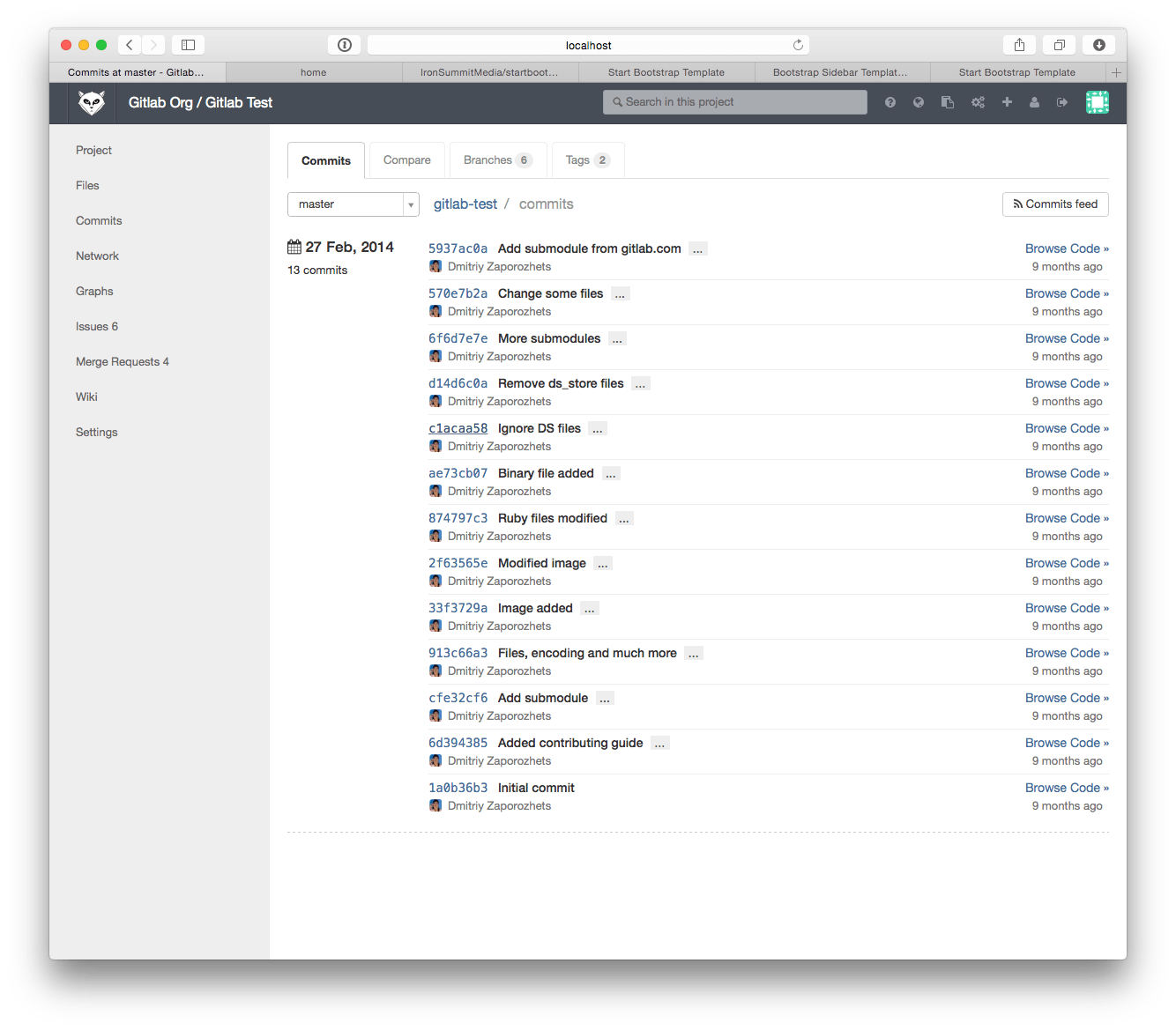
We set a simple goal: Maximize improvements with minimal changes. To do this, we started with the existing UI, rather than a blank page.
Instead of Photoshop, we turned to the web inspector in the browser to prototype. Make some changes, screenshot, repeat. Dmitriy noted: "This reminds of playing old-school video games, where you have to start over with every death."
After a day of prototyping, we piled up quite some screenshots. We immediately threw away a large part and let the rest sink in.
A few days later, the winner was obvious.
The winning prototype
Get Feedback
Changing the UI is uncomfortable for the end-users. You need time to adapt to the changes.
For this reason, people often get upset about a redesign. Even if your redesign is much better.
We wanted to brace our community and ourselves for this, so we started with a tweet
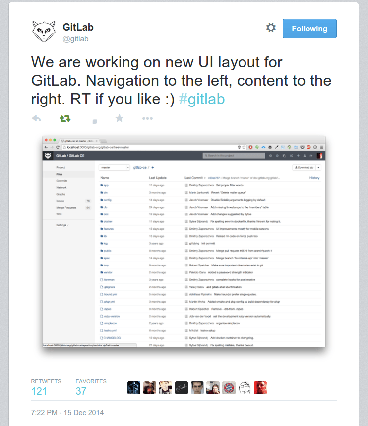
We got lots of great advice and most people seemed to like our idea. The next steps were clear.
We implemented, improved and polished the design. As we build with and on our community, we couldn't wait to share it. We set up a staging server with the new changes. This way, everyone could try the redesign even before it landed in master.
Working with an open source product allows us to work with our (awesome) community. Contributors started submitting merge requests with improvements to our redesign. This was a great sign.
Evaluate
At start of this post we described problems we want to solve with redesign. And during work its important to remember the goal. So we just listed each problem was solved by new layout:
We started with a list of issues we wanted to solve with the redesign. Focus is important, so we went back and made sure we checked all boxes:
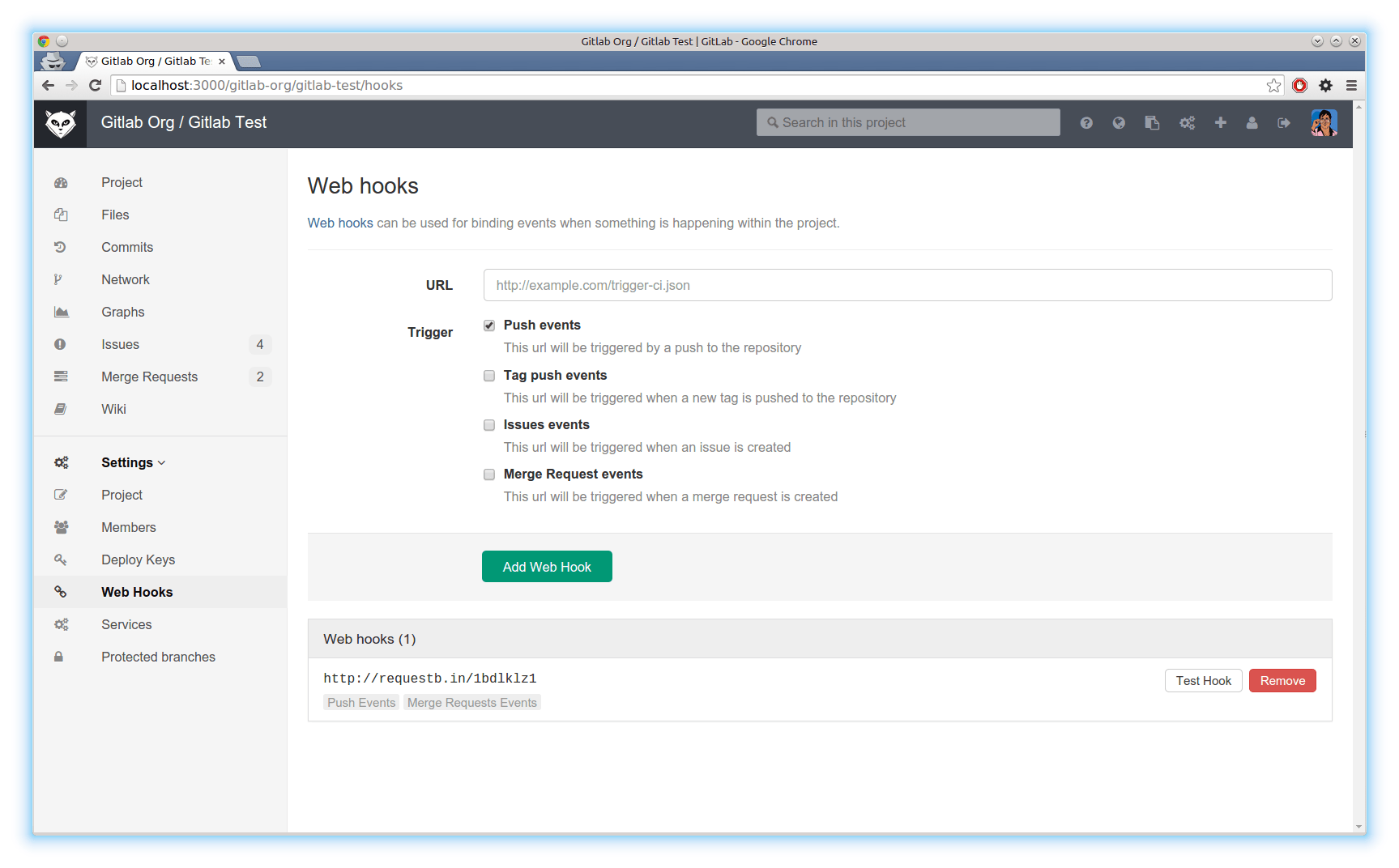
- Limited space in project navigation: fixed by moving it to the side.
- This also gives us more vertical screen real estate -We fixed the navigation, so no more scrolling!
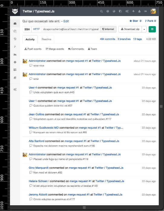
- Better use of icons! We even introduced a responsive state, where on only the icons are shown.
- We got rid of the third level of navigation
Finish up
With the support of the community, we started to build on top of the redesign.
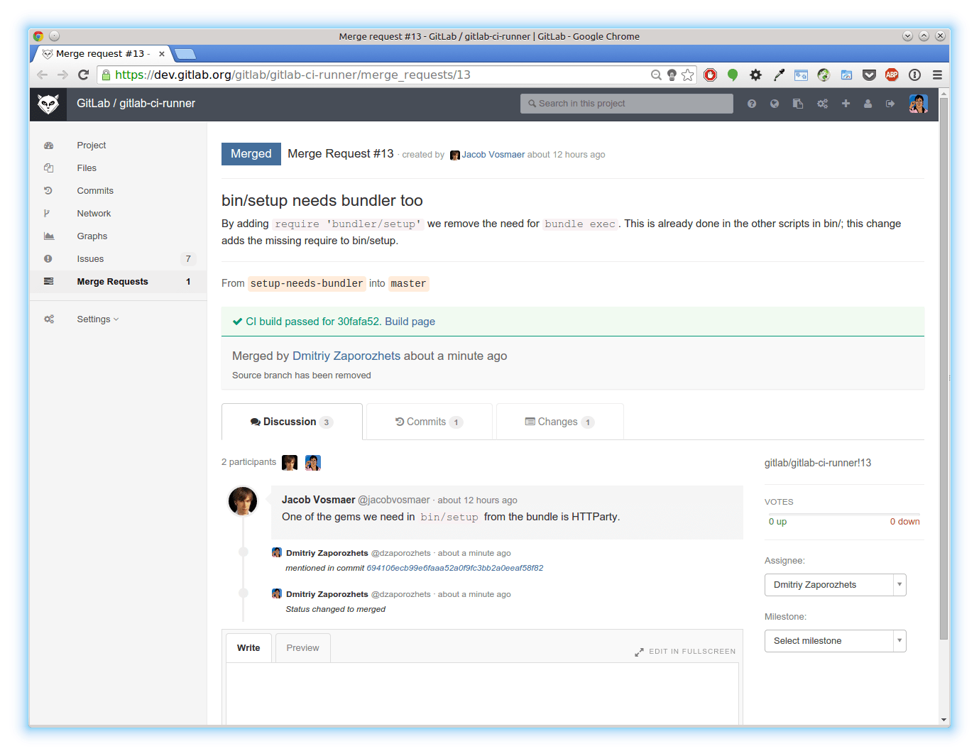
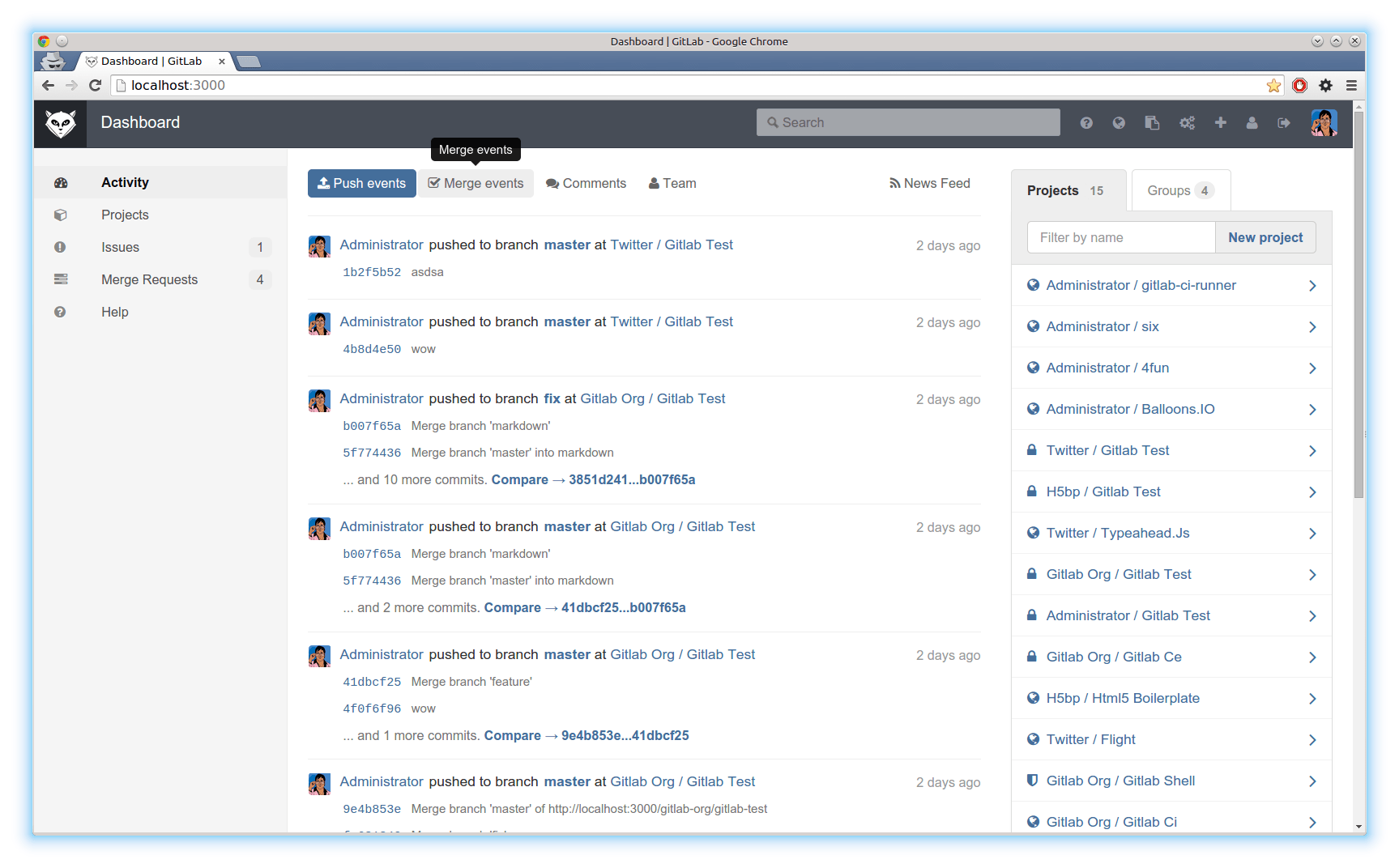
We changed the layout of several pages to make use of the extra space
and applied another layer of polish.
With everything aligned and fixed, we were done.
We're really excited about the process of redesigning the navigation. The cooperation with the community and implementation of their feedback was invaluable. We hope you'll love it too.
The new navigation will be released with GitLab 7.7 on January 22nd. If you want to give it a try now, head over to GitLab.com, as the changes are already live there!
Find out which plan works best for your team
Learn about pricingLearn about what GitLab can do for your team
Talk to an expert
